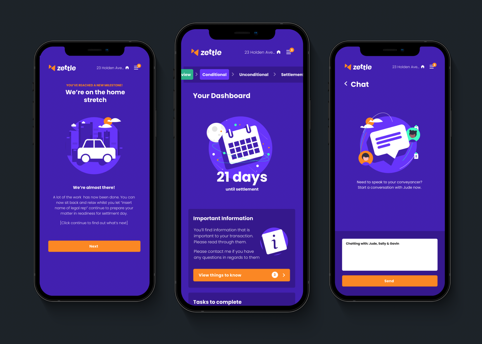
Zettle
A new concept workflow and communications platform for the Conveyancing industry.
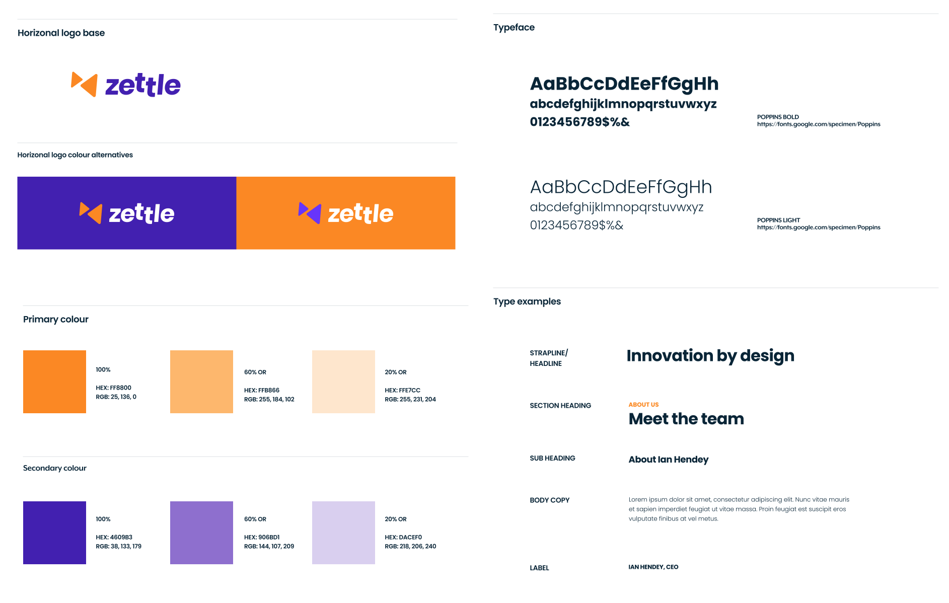
Brand development
Having a solid foundation for the platform's look and feel makes it so much easier to develop the UI going forward. It means you can jump straight into high fidelity mock ups, by-passing tedious wireframe creation and getting to a final solution more efficiently and faster.
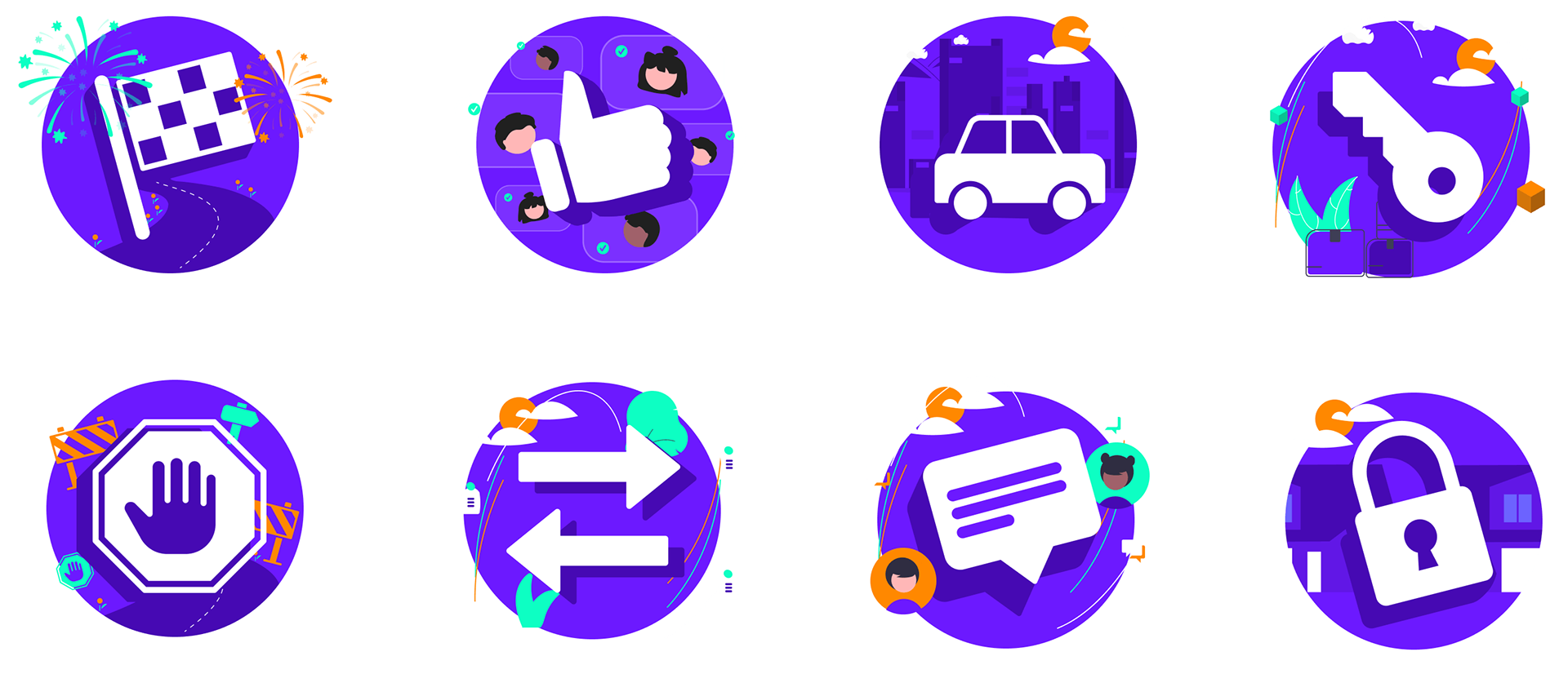
Illustrations
I designed a fun and playful illustration style which were animated in Lottie and included as a key feature of the user interface. It gives a sense that the conveyancing process is simple and easy and all they need to do is follow along like it's a children's picture book.
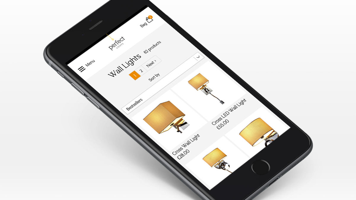
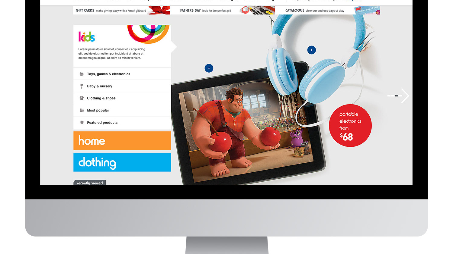
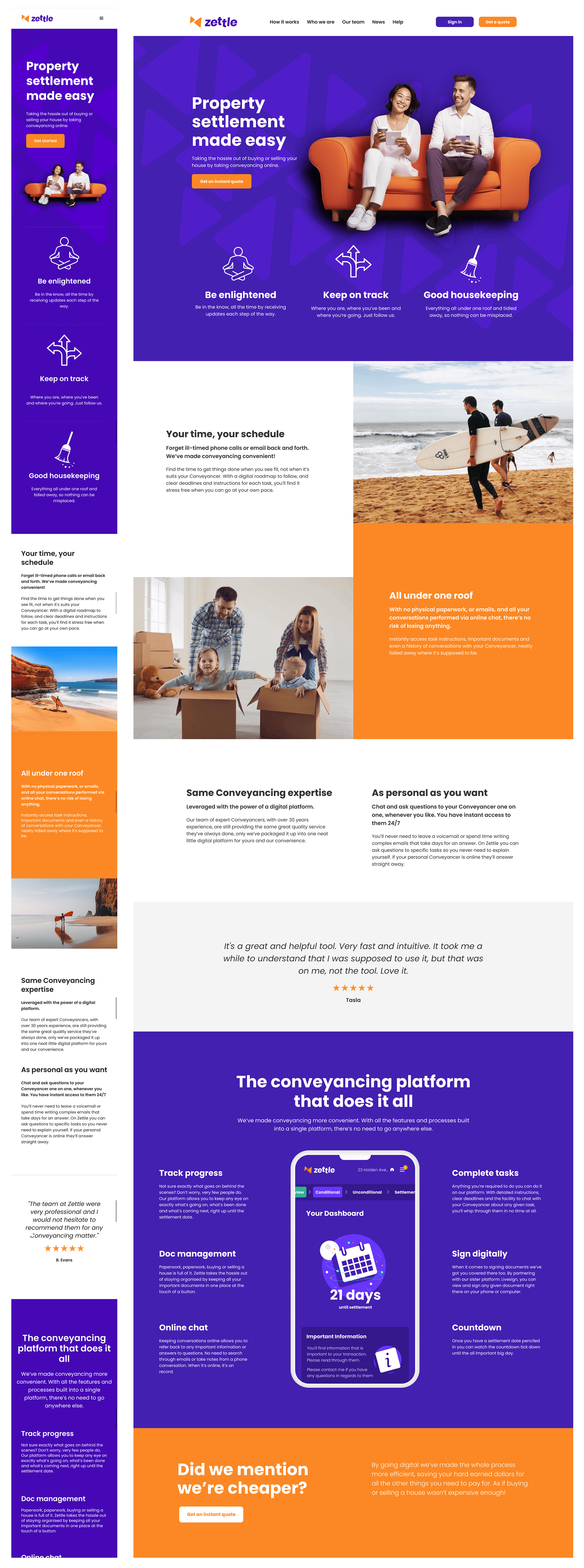
Acquisition web pages
The marketing pages are a designer's playground to figure out the rest of the look and feel. Trying out type combos, adding in some illustration and photos and getting a feel of the colour palette and use sets the scene for a more minimal and formal feel in the product itself.
Product UI
When working on the product UI the problems you're trying to solve can be very complex. You don't want to be deciding what something should like look like at the same time as how something should work functionally. It's import to separate these 2 very different processes into different streams of work, regardless if the same designer is doing both.