Qantas
I spent six months at Qantas in late 2015. The agile and lean UX team I was part of was assigned to transform qantas.com into the latest a greatest airline website out there starting from a shiny new brand development guide.
User journeys
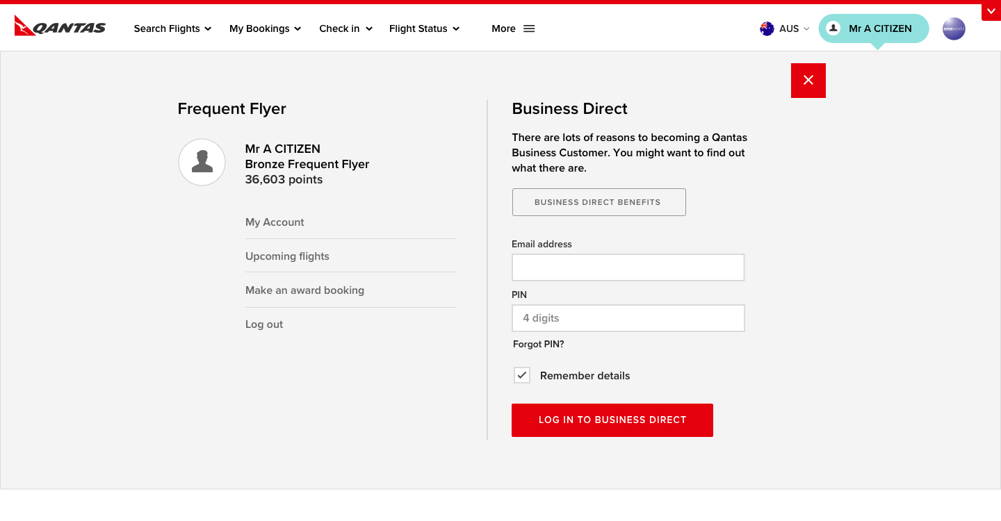
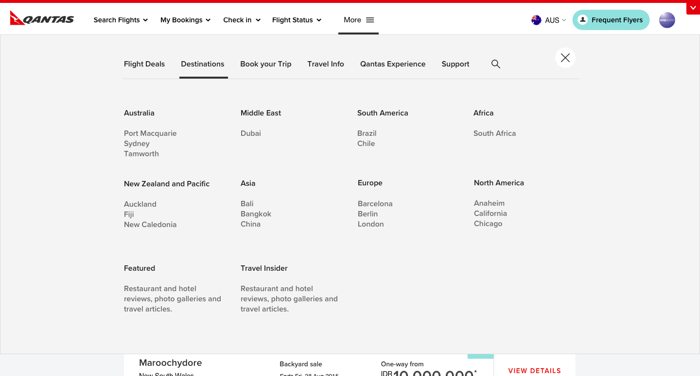
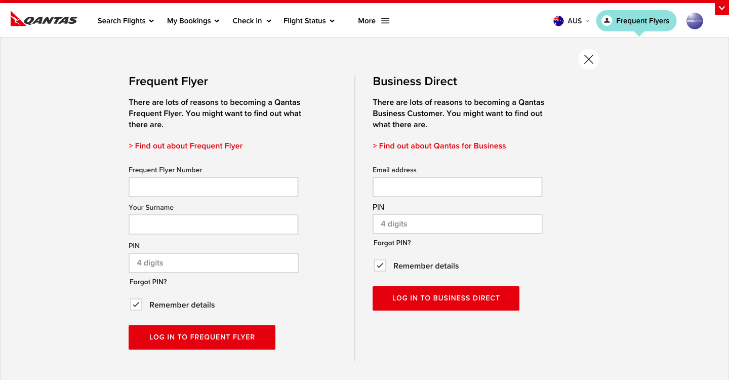
We concentrated on transforming key user journeys and UI elements that would provide the biggest change in meeting business objectives. The one I spent the most time on was the main site masthead and navigation system.
User testing
Luckily for us we had a very convenient user testing location and recruitment process. We spent most Friday afternoons stopping and chatting to Qantas flyers waiting in the airport terminal for their flights. Not only did we have users who we knew were customers but also had nothing better to do than help us.
